
Measurable & Effective Click Through Rate (CTR) Engagement
CTA placement and design is a strategic aspect that leads to increased CTR on any product page.
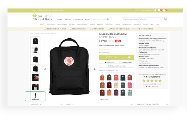
Mobile CTA Placement - Handbags and Luggage
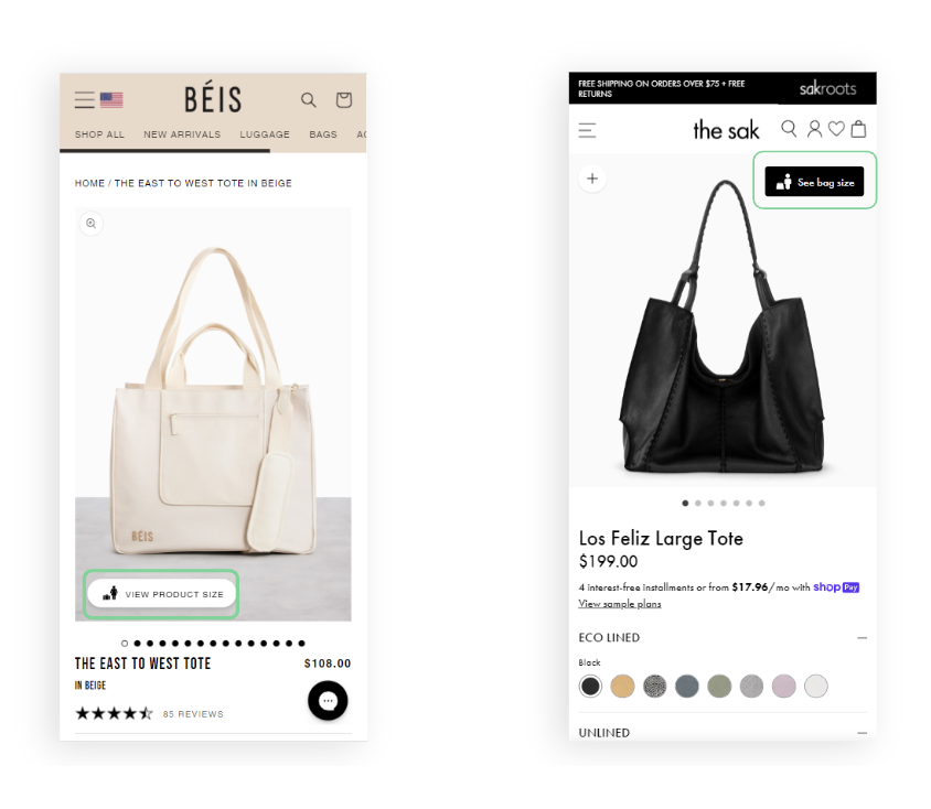
Ideal mobile CTA placement is close to the image, above the fold, and close to the add-to-cart button. This placement generates a 12-23% CTR.
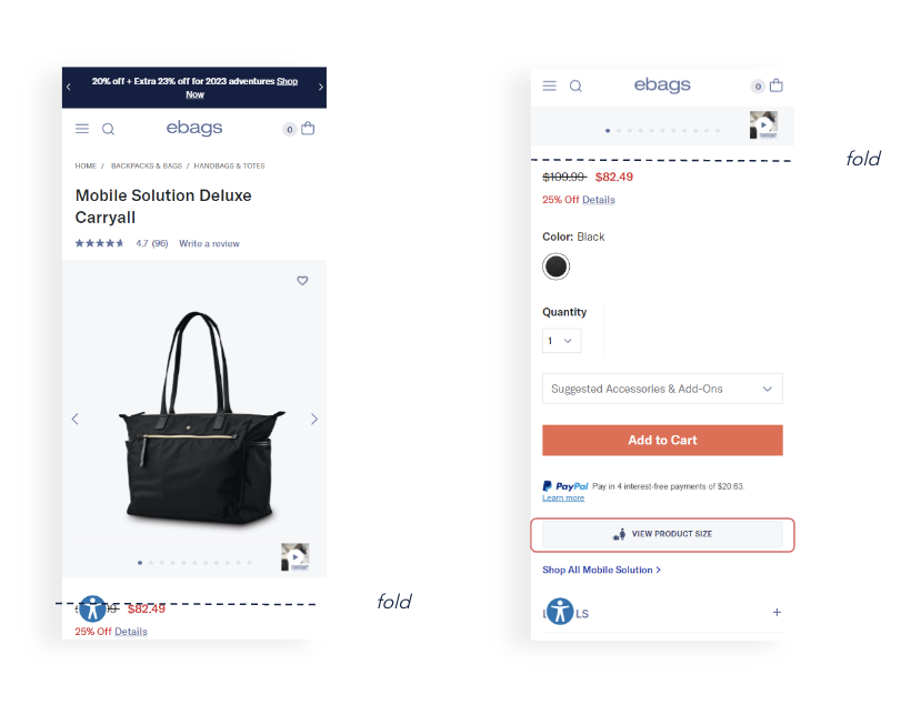
Poor mobile CTA placement is below the fold, on a second screen, or requires scrolling this results in a CTR less than 10%.
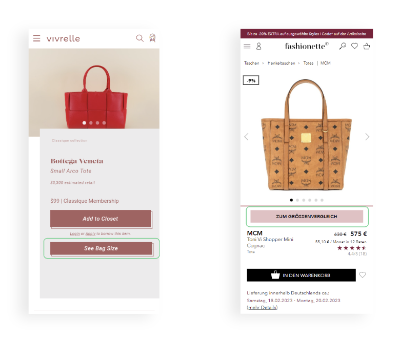
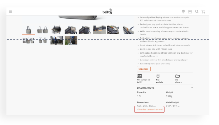
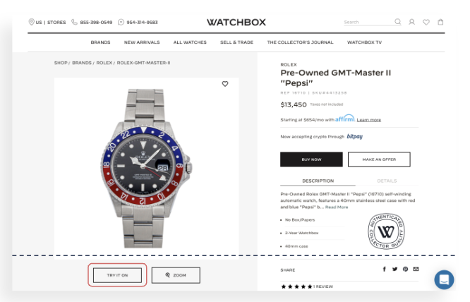
Desktop CTA Placement - Handbags and Luggage
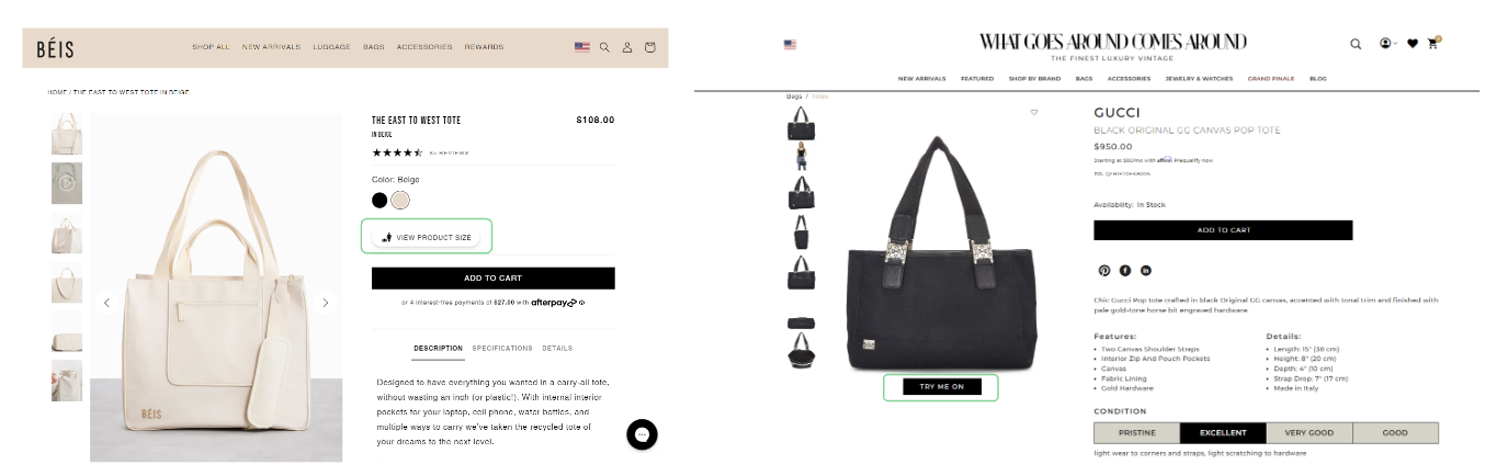
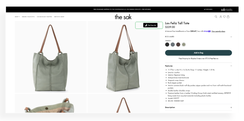
Ideal desktop CTA placement includes both an icon and text is above the fold, above the add-to-cart button, and close to the image. This results in a CTR between 15-30%.
Another ideal desktop CTA placement is within the carousel. This results in a CTR between 30-50%.
Poor desktop CTA placement is text only, below the fold, and an inaccessible CTA. This results in a CTR less than 10%.
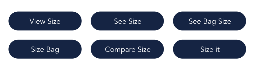
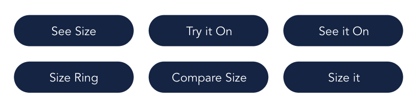
Suggested CTA Text - Handbags and Luggage
Mobile CTA Placement - Watches
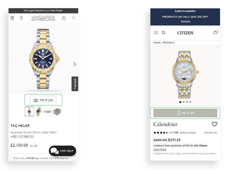
Ideal mobile CTA placement for watches is close to the product image, above the fold, and includes an icon and text. This results in a 10-30% CTR.
Desktop CTA Placement - Watches
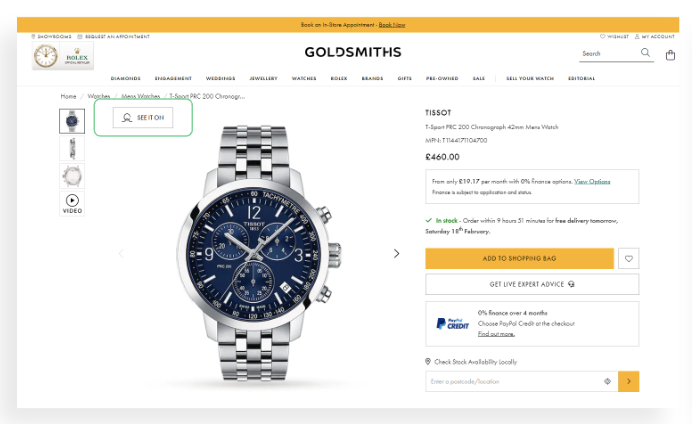
Ideal desktop CTA placement for watches is above the main product image and above the fold. This results in a 10-30% CTR.
Poor desktop CTA placement for watches is below the fold and requires scrolling. This results in a CTR less than 10%.
Mobile CTA Placement - Jewelry
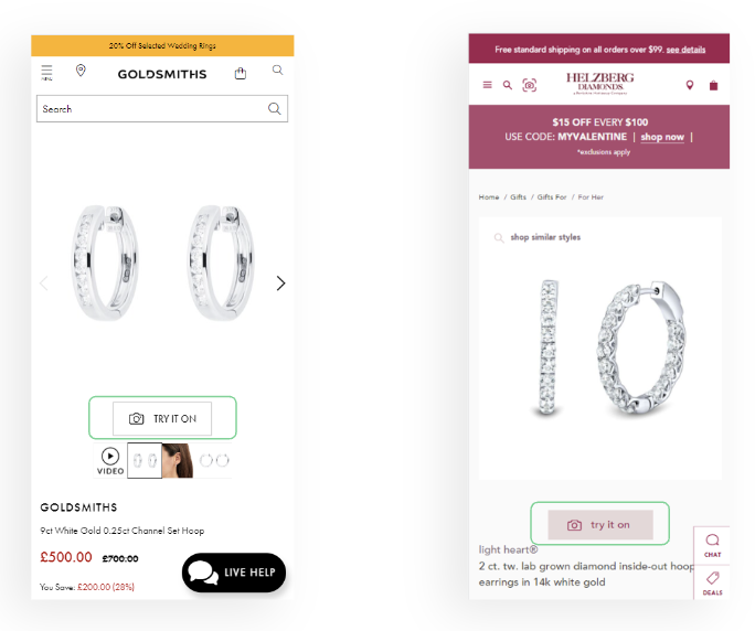
Ideal mobile CTA placement for jewelry is placed close to the product image, above the fold, and includes an icon and text. This results in 15-30% CTR.
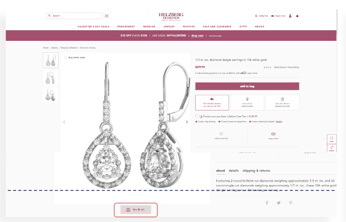
Desktop CTA Placement - Jewelry
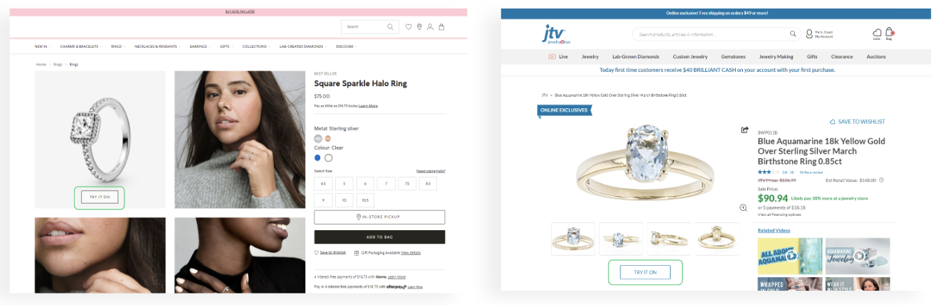
Ideal desktop CTA placement for jewelry is placed on the main product image, above the fold, and close to the carousel. This results in a 15-30% CTR.
Poor desktop CTA placement for jewelry is below the fold and requires scrolling. This results in a CTR less than 10%.
Suggested CTA Text - Jewelry
Summary
- Position CTA above the fold, avoid scrolling
- Place CTA close to the main image
- Make your CTA look clickable: use an actual button element, not just a text link
- Add an icon to attract the user's attention
- Use short text and action words
- Consider different CTA locations between the devices
- Incorporate your brand’s visual language (fonts/colors)
- Give your CTA some space - to draw attention to it
- Customize your CTA to fit your unique PDP (including the size and placement of your main image and the scale of your website page)