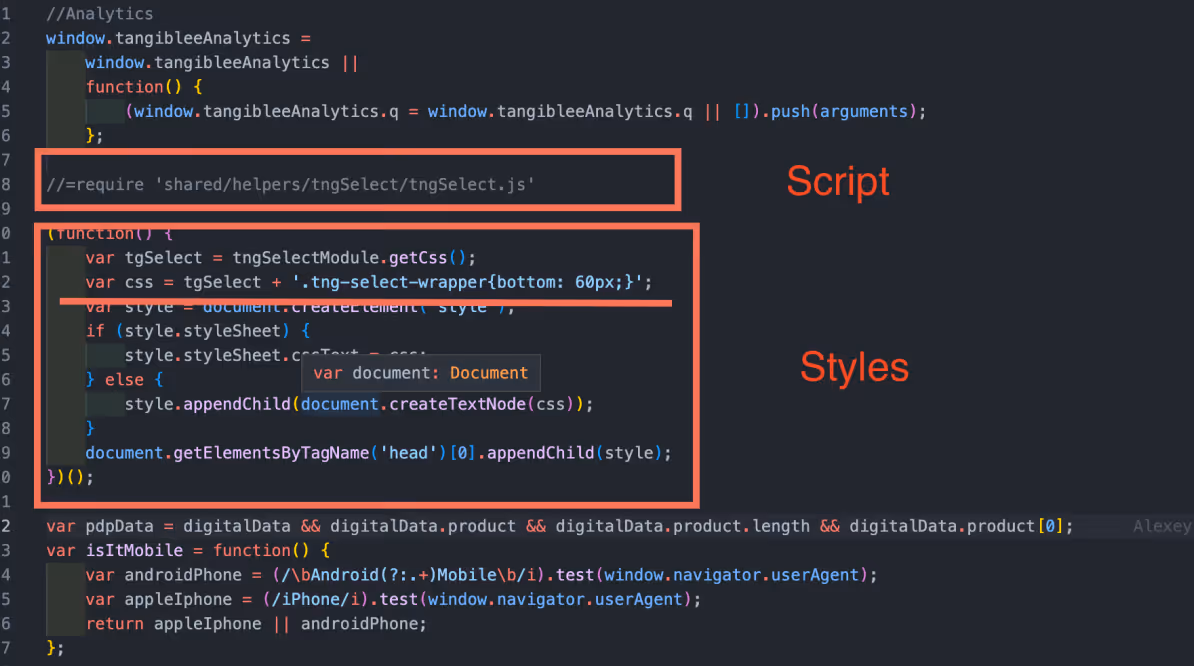
Adding the script tngSelect.js and styles to the tangiblee-mapper.js.
//=require 'shared/helpers/tngSelect/tngSelect.js'
(function() {
var tgcarousel = tngCarouselModule.getCss();
var tgSelect = tngSelectModule.getCss();
var css = tgcarousel + tgSelect + '<< style.css >>';
var style = document.createElement('style');
if (style.styleSheet) {
style.styleSheet.cssText = css;
} else {
style.appendChild(document.createTextNode(css));
}
document.getElementsByTagName('head')[0].appendChild(style);
})();
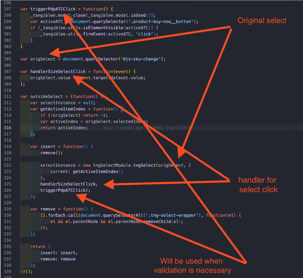
Step 2:
Adding our custom select to mapper.
For example:
var origSelect = document.querySelector('#js-sku-change');
var handlerSizeSelectClick = function(event) {
origSelect.value = event.target.dataset.value;
};
var outsideSelect = (function() {
var selectInstance = null;
var getActiveItemIndex = function() {
if (!origSelect) return -1;
var activeIndex = origSelect.selectedIndex;
return activeIndex;
};
var insert = function() {
remove();
selectInstance = new tngSelectModule.tngSelect(origSelect, {
current: getActiveItemIndex()
},
handlerSizeSelectClick,
triggerPdpATCClick);
};
var remove = function() {
[].forEach.call(document.querySelectorAll('.tng-select-wrapper'), function(el) {
el && el.parentNode && el.parentNode.removeChild(el);
});
};
return {
insert: insert,
remove: remove
};
})();
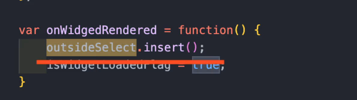
Step 3:
The select would be added when a user clicked on a CTA and opened the widget.
var onWidgedRendered = function() {
outsideSelect.insert();
}
Step 4:
In order to inject the selector, we would need to add a free space in the footer of the widget where we should add the external classes(tg-size-selector/tg-color-selector) in integration. Also we should add the styles below in widget (client's css file).
Add a custom ring size selector to the Tangiblee widget. Covers recommended size options, UX best practices, and configuration steps for a consistent shopper experience.